

Color
Color is a valuable element of design. It can be used to show emphasis, direct focus, represent a brand, evoke emotion, identify or classify a group, convey depth and so much more. When incorporating color, use strong color contrast and avoid relying on color alone to convey meaning.
Color Contrast
Color contrast is how foreground color stands out from its background color. Text must meet minimum color contrast ratios to ensure information is legible for people with low vision.
Regular text must meet a minimum contrast ratio of 4.5:1. Large text must meet a minimum contrast ratio of 3:1. Large text is defined as text that is at least 18pt or at least 14pt and bold.
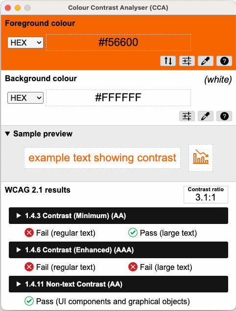
The combination of Clemson Orange (#F56600) and white does not meet color contrast requirements for regular text.
When using Clemson Orange with white, ensure that you are using it with large text. For regular text, consider using Campus Brick (#B94700) or Regalia (#522D80) instead of Clemson Orange.
Color Contrast Tools
Colour Contrast Analyser is a free tool that includes a color picker to measure contrast requirements to ensure WCAG 2.1 AA conformance, available for Windows and Mac.
Clemson's brand style guide includes the University's full color palette and color contrast grid.
Exceptions
Color contrast requirements do not apply to the following:
- Logos
- Purely decorative text and images
However, we encourage you to ensure your logo text has sufficient contrast regardless!
Color Reliance
Using color to identify or distinguish content can simplify information and make a design visually appealing. However, using color alone to convey meaning can create accessibility barriers for people with low vision.
Options to avoid color reliance include the following:
- Include text labels. For example, in a colored line chart, identify each line with a text label.
- Use patterns or symbols. For example, if comparing data on apples, pears and oranges on a pie chart, include fill patterns like dots, chevrons, stripes, honeycombs, basket weaves or lattices.
- Provide additional information in text. For example, if a map is used to identify the average income in each state, provide a data table or bulleted list with the information.
Any combination of these options will help reduce accessibility barriers.