

Tables
Tables provide structure for data. That structure is conveyed both visually and by screen readers.
Tables require headers (not to be confused with headings) to convey their structure. Make sure tables have properly defined headers for columns or rows. Do not rely solely on visual styles to convey that a cell is a header cell. See related techniques for instructions to apply table headers in different authoring tools.
Use tables to organize data, not to create content layouts.
Move table titles and footnotes out of the table structure. For example, avoid merging the top row of cells to put the table title in the first row. Instead, place the table's title above the table or in a table caption. If data in cells need additional clarification (as with an asterisk or when citing the author), the description should go underneath the table as paragraph text and not in a merged row across the bottom of the table.
Avoid empty cells when possible. Never nest a table within a table.
Adhere to other accessible design concepts for table content: color contrast and reliance, alternative text for images, and link text. For lengthy or complex data sets, provide a link to the data source (e.g., an accessible Excel file).
Complex Tables
Simple tables contain headers in the first row or column, without any split or merged cells. Complex tables are formatted with merged or split cells, multi-level headers, or headers outside of the first row or column.
When possible, use a simple table design. Authoring tools may limit the accessibility of complex tables. For example, in Microsoft Word, it is not possible to apply multi-level headers in a single table. See related techniques for more information.
Scope
Cells must be associated with their respective headers. This association is provided by a table header's "scope." The scope defines if a header applies to a row, a column or both. Header scope is typically implied for simple tables.
A row scope indicates that a header applies to the cells in that row. This scope is used when a table's first column contains header cells: each cell in the first column has a row scope.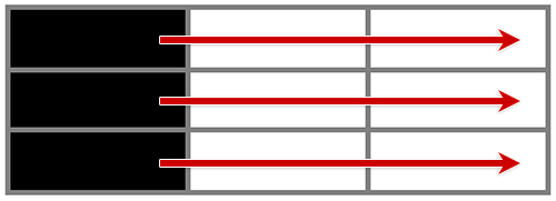
A column scope indicates that a header applies to the cells in that column. This scope is used when a table's first row contains header cells: each cell in the first row has a column scope.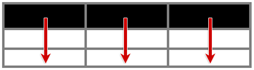
A scope of both is used when a header applies to cells in both its row and column. This scope is used for the header cell at the top left of a table.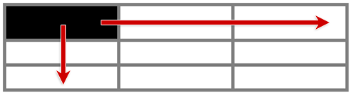
Header scope can be defined when using HTML or PDF formats. The W3C Tables Tutorial provides several examples of authoring complex tables with HTML.
Merged Cells
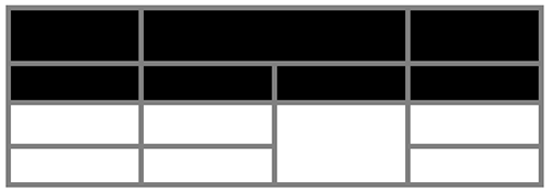
When cells are merged, the number of columns or rows they span must be defined. The following illustration contains two merged cells:
- A header cell located in the first row and second column, spanning two columns
- A data cell located in the third row and third column, spanning two rows
Column and row spans can be defined when using HTML or PDF formats.
Techniques
Additional Resources
- Tables Tutorial (W3C)
- Understanding Information and Relationships (WCAG 2.1)