Design Elements
Data Visualization
Visualizing information graphically can impact comprehension and retention. Consider best practices when creating data-centric graphics.

What Is an Infographic?
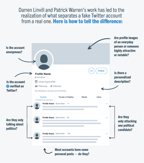
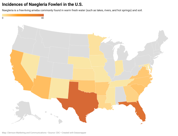
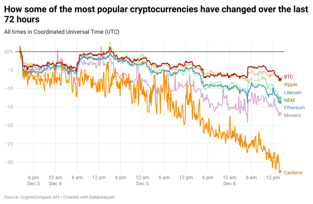
Infographics are charts/diagrams or illustrations that visualize data, focusing on the key relationships, correlations or insights from it. Infographics can be a powerful tool for communication, but knowing when to use them is key:


Infographic Do’s and Dont’s
DO USE INFOGRAPHICS:
- To represent complex insights that are hard to deduce from raw data. Use charts, graphics and diagrams to illustrate the correlations and takeaways of the data.
- To explain processes in a visual step-by-step manner.
- To visualize percent categorically.
- To visualize data counts or percent categorically (i.e., two out of five students…).
- To highlight or summarize a key idea or data point in a visually impactful way.
DO NOT USE INFOGRAPHICS:
- To represent data that does not clearly have any visual associations.
- To represent information that is simple enough to be stated without visual aid.
- To make simple data more complex.
- To visualize information that is very formal or serious in nature.
When creating infographics for your communication, strive to use brand colors, fonts and iconography whenever possible.
Infographics in Digital Mediums
Make sure your visuals are appropriately tagged and have descriptive alternate text for each individual visual data point in the overall infographic to ensure that your visualization is accessible for everyone. Avoid using shades of the same color as the only differentiator for labels, categories and associations.
If you are designing for digital mediums, consider ways you can make your infographics interactive to add value to your communications. Datawrapper is an excellent tool for creating infographics that can be embedded and made accessible.


Learn more about the kinds of visualizations you can create with Datawrapper.
