Typography
Type Basics
Knowing the fundamentals and best practices of typography can help make communication more impactful, effective and readable.
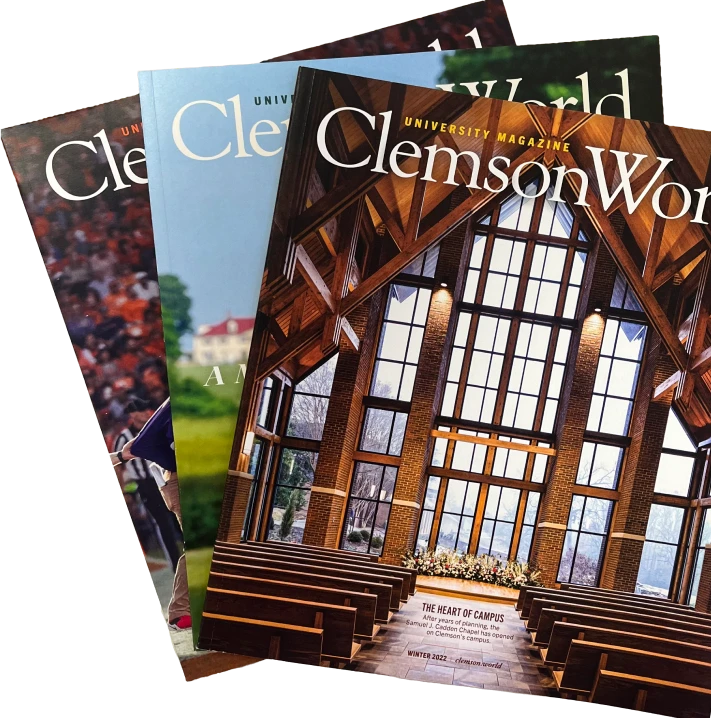
Type is a fundamental element of design that plays a crucial role in conveying information, creating a visual style and establishing a visual hierarchy that helps the reader move through communications material in an intuitive way. Understanding the basics and best practices of typography can make you more effective in your communications across print, web and digital media.
Fonts vs. Typefaces
Trade Gothic Next
Light
Light Italic
Heavy
Heavy Italic
Regular
Regular Italic
Bold
Bold Italic
Regular Condensed
Regular Condensed Italic
Bold Condensed
Bold Condensed Italic
Heavy Condensed
Heavy Condensed Italic
Regular Compressed
Bold Compressed
Typeface: the overall design of the type and its letterforms, specifically referring to the distinct visual style of the characters themselves.
Trade Gothic Condensed Bold Italic
Where the blue ridge yawns its greatness
Font: the specific variation/style of a typeface.
Selecting Typography
Choosing the right typeface for your project can impact the feeling your communication creates and how it can be perceived. However, it is not just a stylistic choice. Consider the following when choosing your type:
-
Legibility: The main goal when using type is to convey a message. Make sure that the message is clearly readable for the end viewer. Also consider accessibility to ensure that viewers with visual disabilities can still read and understand the text.
-
Appropriateness: Certain typefaces create different feelings, moods and associations. Make sure that your choice of typeface aligns with the type of content you want to communicate and that it is appropriate for that use case.
-
Consistency: Consistency in the application of branding, including the use of type, builds brand equity. Wherever possible, strive to utilize Clemson’s core brand font palette.
Type Controls
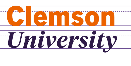
Size, kerning, tracking and leading are critical character controls in typography that impact the experience of and overall legibility of text:
-
Size: Larger font sizes typically indicate headings and titles, while smaller sizes are used for body text. Be careful that font sizes in your type hierarchy are not too similar. This can confuse the reader as to the order and importance of the information.
-
Leading:Leading, or line spacing, refers to the vertical space between lines of type. Optimal leading ensures that lines are spaced in a way that is visually pleasing and enhances readability. Best practice for body text is that leading is equal to 120 percent of the font size.
-
Kerning: Kerning is the adjustment of space between individual characters within words. Optimal kerning creates evenly spaced type by removing any awkward gaps or overlaps between letters.
-
Tracking: Tracking is the adjustment of space between all, applied evenly to a piece of text. It can be used to tighten or loosen the type within your design and can create interesting stylistic design opportunities. Best practice is to not track above or below +/- 25 points.
Typography Hierarchy
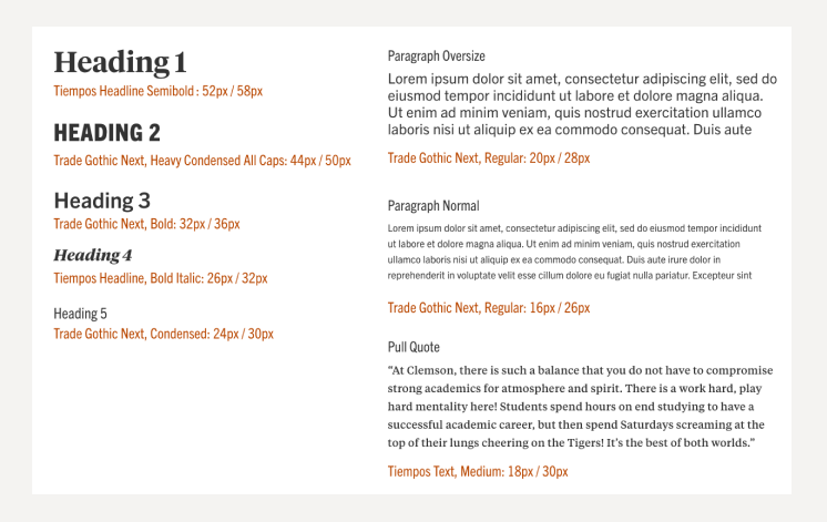
Typography hierarchy is the system of typefaces and styles arranged from most important to least. Using a sound type hierarchy in your communication guides the reader's eye and emphasizes information in a structured manner. Here are key elements of typographic hierarchy. To create an intuitive type hierarchy, shoot for at least three distinct levels of type with contrast demonstrated through size, weight, color and font style.
H1 Heading
H2 Heading
H3 Heading
H4 Heading
H5 Heading
Type Scales
Paragraph Formatting
Beyond character styling, styles applied to paragraphs of text can also greatly impact the effectiveness of your designed communication. A few important considerations when styling your paragraph copy are:
-
Line length: Avoid lines of text that are too long or too short. Line length can have a great impact on the legibility and flow of reading. Avoid extremely long lines of text, which can be difficult to read. Optimal line length is typically between 50-60 characters per line.
-
Paragraph spacing: Appropriate spacing between paragraphs helps organize content and guides the flow of the reader's eye.
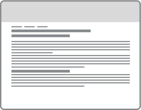
Paragraphs with no space between can create large overwhelming blocks of copy, while extreme line lengths can be tiresome to read.
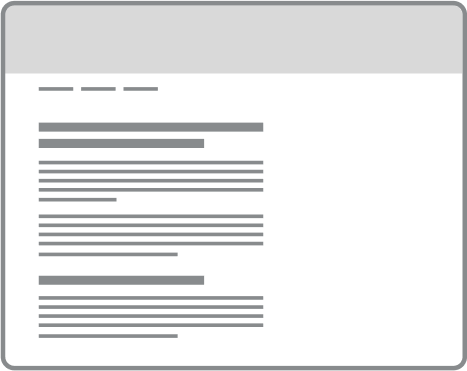
Properly sized and spaced paragraphs allow for copy to easily be scanned for important information and visually organizes content in a quickly understandable heirarchy.
Alignment: Left, right, center or justified text may be appropriate depending on the length and application of your text. The alignment should be consistent within a design to remain cohesive. For larger paragraphs, best practice is to left-align text.

Justified paragraph text creates rivers of white within paragraphs and inconsistent spacing between words making them hard to read

Left aligned paragraphs best fit our western style of reading from left to right and top to bottom. They are the easiest to read because they creating a consistent edge for the eye to return to after finishing a line of text.
