Web
Type on the Web
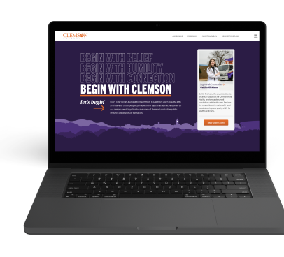
Our website serves as the primary source of information for those wanting to learn more about Clemson. Using type on the web effectively is key to conveying your message to its audience.

Clemson's brand typefaces, primary and secondary, provide equal parts traditional and modern character, carrying forward our institution's past while still squarely facing the future. Most brand fonts are readily available through Adobe Fonts and can be activated through your Adobe Creative Cloud account at fonts.adobe.com. Licensed brand fonts are available by request at the discretion of Marketing and Communications. For more information, visit the typography section of the Clemson brand guide.
Primary Web Typefaces
Serif Typefaces
- Tiempos Headline
- Tiempos Text
Browser Fallback Fonts
- Times New Roman
- Georgia
Sans-serif Typefaces
- Trade Gothic Next
- Trade Gothic Next Condensed
- Trade Gothic Next Compressed
Browser Fallback Font
- Verdana
- Franklin Gothic
- Arial
Please note that only the fonts listed above and those available through Adobe Fonts are licensed by the University for use on clemson.edu. Some brand typefaces will require an additional purchase of a web font license for website and mobile applications.
Typefaces that require the purchase of a separate web license include...
- Biotif
- Tiempos Headline - (Sites or Applications not part of Clemson.edu)
- Tiempos Text - (Sites or Applications not part of Clemson.edu)
- Tiempos Fine
- Hoefler Text
- Goudy Old Style
- Trade Gothic
For more information on how to license typefaces, please visit the typography section of the brand guide.
Headings
Default Headings
Desktop
Heading 1
- Font Size: 53.75px / rem
- Line-Height: 64px / 4rem
Heading 2
- Font Size: 44.79px / rem
- Line-Height: 48px / 3rem
Heading 3
- Font Size: 37.32px / rem
- Line-Height: 40px / 2.5rem
Heading 4
- Font Size: 31.1px / rem
- Line-Height: 28px / 1.75rem
Heading 5
- Font Size: 25.92px / rem
- Line-Height: 28px / 1.75rem
Mobile
Heading 1
- Font Size: 36px / rem
- Line-Height: 40px / 2.5rem
- Max-width: 800px
Heading 2
- Font Size: 32px / rem
- Line-Height: 36px / 2.25rem
Heading 3
- Font Size: 31.1px / rem
- Line-Height: 28px / 1.75rem
Heading 4
- Font Size: 25.92px / rem
- Line-Height: 24px / 1.5rem
Heading 5
- Font Size: 20px / 1.125rem
- Line-Height: 24px / 1.5rem
Using Heading Elements Appropriately
- Create one and only one H1 heading for each page. For the new templates, this should actually be built in as an option at the very top of the page builder. The H1 should describe the topic of the page and should not be used for news headlines or event promotion unless those are the main purpose of the webpage.
- Properly nest all other heading levels (H2 to H6) such that a given heading level does not appear on a page until the one immediately preceding it has.
- Do not use H1-H6 header markup to style any content other than heading text.
Line Length
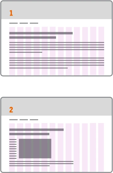
The line lengths of body copy across all screen sizes should typically fall between 45 to 85 characters (including spaces and punctuation) per line. Excessively long and short line lengths impact legibility because of the increased difficulty in locating the next line of a paragraph and increasing mental strain on the reader.
Creating Optimal Line Length in Cascade
When using the columns widget in Cascade, the column will default to 12 columns which is the full width of the screen. Be sure when placing copy that you adjust the width value of your columns to allow your text to fall within these values. For a single column layout, a column value of 6 or 7 will typically be in the correct range.

Improper Use Example
Figure 1: An overly long line length spans the full page.
Figure 2: Columns used but a floated image causes left-hand copy to squish into a small column of text as the browser size scales down. Copy and images should be set in their own appropriately sized columns.

Proper Use Example
Figure 3: Copy for a single column layout is placed into a correctly sized column width.
Figure 4: Image and copy are placed in their own appropriately sized columns. This layout will reflow correctly as screen sizes scale down.
Creating optimal line length in Cascade
Intro Section Boilerplate Code
The Intro Section of the interior page template currently doesn't provide the option to set column widths via dropdown like the normal columns module and has to be set up manually in HTML. The provided boilerplate below can be used quickly create a grid and column structure for this intro section.
<div class="grid-x grid-margin-x grid-margin-y">
    <div class="cell large-7">
        <p class="cu-oversize">Your copy paragraph Goes Here</p>
    </div>
    <div class="cell large-5">
        <p class="cu-oversize">Your Image Goes Here</p>
    </div>
</div>
Type Utilities
Paragraph Class Utilities
Please see different paragraph types below
Default
Lorem ipsum dolor sit amet, consectetur adipiscing elit, sed do eiusmod tempor incididunt ut labore et dolore magna aliqua. Ut enim ad minim veniam, quis nostrud exercitation ullamco laboris nisi ut aliquip ex ea commodo consequat.
Subtle Paragraph (Class name: cu-subtle)
Lorem ipsum dolor sit amet, consectetur adipiscing elit, sed do eiusmod tempor incididunt ut labore et dolore magna aliqua. Ut enim ad minim veniam, quis nostrud exercitation ullamco laboris nisi ut aliquip ex ea commodo consequat.
Fine Print (Class name: cu-fine-print)
Lorem ipsum dolor sit amet, consectetur adipiscing elit, sed do eiusmod tempor incididunt ut labore et dolore magna aliqua. Ut enim ad minim veniam, quis nostrud exercitation ullamco laboris nisi ut aliquip ex ea commodo consequat.
Oversize Paragraph (Class name: cu-oversize)
Lorem ipsum dolor sit amet, consectetur adipiscing elit, sed do eiusmod tempor incididunt ut labore et dolore magna aliqua. Ut enim ad minim veniam, quis nostrud exercitation ullamco laboris nisi ut aliquip ex ea commodo consequat.
Screenreader Only Text (Class name: show-for-sr)
This allows you to hide content while still making it readable by screen reader. Link to foundation utility
I am only visible to screenreaders.
Typography Utilities
Please see typography utility classes for any element below.
Class name: heavy / example heavy text
Class name: condensed / example Trade Gothic Next Condensed text
Class name: tiempos-italic / example Tiempos Headline Italic text
Class name: text-accent / example text with an accent
List Utility
Add the class no-bull to a ul or ol tag to eliminate bullets, margin and padding styles
<!—- No Bullets, margin, or padding —>
<ul class=“no-bull”>
  <li></li>
</ul>
<!—- No Bullets, margin, or padding —>
- I am an unordered list item
- i am another
- and another
- I am a link!!
Add the class link-underline to a ul or ol tag within WYSIWYG's to apply underlines to links
<!—- link underlines —>
<ul class=“link-underline”>
  <li></li>
</ul>
<!—- link underlines —>
- I am an unordered list item
- I am a link!!
- and another
- I am a link!!
