Design Elements
Grid Systems
Using a grid system can provide a structured framework for designs that enables well-aligned and organized compositions.

Column Grids
Use column grids to assist with page layout. Structure layouts by aligning elements on the page to columns or by spanning the elements across multiple columns. These grids allow designers to use any subdivision of the overall column number to create symmetrical or asymmetrical layouts.
Five-Column Grid
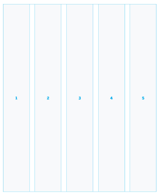
A simpler grid system that allows for up to five columns or spanned elements across 3+2 columns or 2+2+1 columns. While a five-column grid is simpler and more approachable, it has its limitations. Symmetrical layouts are not achievable with a five-column system.
10-Column Grid
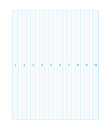
Doubling the columns of a five-column grid allows for all of the same column spans and also provides the option for symmetrical layouts (5+5, 1+4+4+1).
Six-Column Grid
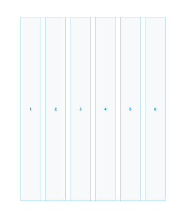
This column grid offers subdivisions of one, two, three and six. It provides the options for symmetrical and asymmetrical layouts and balanced two-column and three-column spans for simpler page layouts.
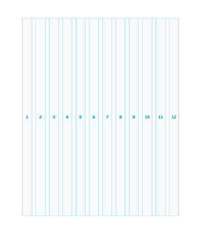
12-Column Grid
Doubling the six-column grid offers the most flexibility in design, allowing for subdivisions of one, two, three, four, six and 12. It provides the option for many symmetrical and asymmetrical layouts. The Clemson University website is built on a 12 column grid.
Modular Grid
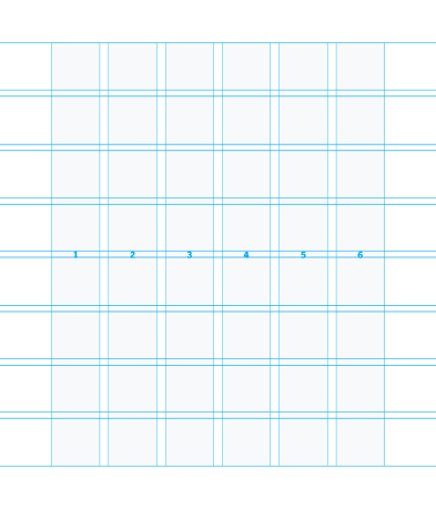
This grid system divides a page into columns as well as guides to create a series of equally sized subdivisions horizontally and vertically. This method is the most complex grid to create from but offers a vast array of layout possibilities. If using a modular grid, use five vertical columns with eight horizontal subdivisions.
