Web
Modules and Widgets
Prebuilt as part of the Cascade templates, modules and widgets allow content editors to create Clemson branded and customized layouts for their content without the need of coding HTML and CSS.

Modules are prebuilt full-width rows of uniquely structured and designed content available to be selected and dynamically moved vertically on the page. Widgets are similar but smaller blocks of content available to use within certain regions of the page. There are some slimmed-down versions of the modules that are available to use as a widget, which are available in the columns module. These smaller version widgets will be explained in more detail in the columns module section below.
Adding Modules in Cascade
Within each new row that is added to a page, a module must first be selected.
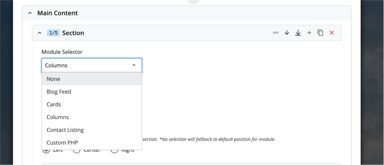
Columns
"Columns" is the most used content module and how you will create most layouts for webpages. It segments the content area of a page into rows delineated into 12 cells that act as containers for your HTML content. The number of cells selected in the module corresponds to the amount of horizontal space allotted in that column. Each row can hold a maximum of 12 cells, so column combinations that exceed 12 will result in the oversized column being pushed to the next line. By organizing content into these rows and columns, you can create the desired design for a page.
Some widgets can also be added within the columns module itself. To be able to choose widgets within the column's module, the column width must be set to six cells or larger. Those widgets include image buttons, quote feature, accordions, and the news and events feeds.
Single-Column Layouts
For text only pages or pages where images and links flow along with the copy. Do not use the full 12 cell width for body copy as it hinders legibility.
- 6 Cells
- 7 Cells
- 8 Cells
Two-Column layouts
Great for pages where content of similar importance can be displayed side by side or when two different types of content are paired side by side, such as copy and photos, widgets, or lists.
- 6 Cells / 6 Cells
- 6 Cells / 5 Cells
- 7 Cells / 5 Cells
- 8 Cells / 3 Cells
Three-Column layouts
- 4 Cells / 4 Cells / 4 Cells
- 6 Cells / 3 Cells / 3 Cells
Cards
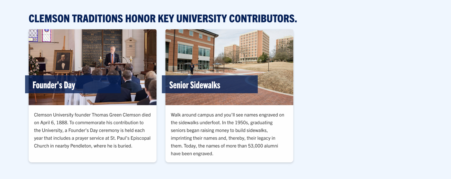
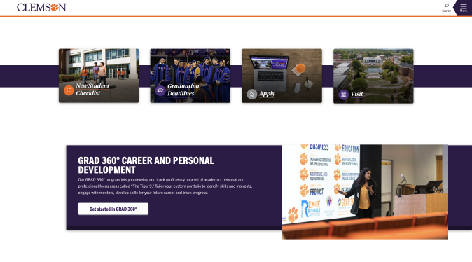
Another way to stylize CTAs, icon cards use a solid background, an icon element, a very brief informative sentence and then the link for the CTA. Choosing image buttons as a module gives the user the ability to utilize the full width of the page. There are also icon cards that can be chosen as a display widget.

A card in the template is a bordered box with some padding around its content. It includes options for headers, content, colors, etc. You can select a background color for the cards module, then you can choose the widget theme color, which will change the background color for the header on each of the cards.
Story and Call to Action Modules
Spotlight Modules
Use a spotlight feature to stylize important content on your page. The most comprehensive version includes a link to a specific story (or event, program, etc.), a short blurb of information and an image that goes along with the feature. The template has two spotlight feature options described below. Both options have a content section, an image selector and the option to add a button below the text. If selecting this spotlight feature to utilize as a CTA, please ensure that you format the content appropriately so that the call to action text is in the button and not in the body text of the feature.
The spotlight feature module does not have enforced character limits, but there are recommended lengths to ensure that the feature stays smaller in height than the image used within the container. The title of the spotlight feature will be set up as an H2; please keep this in mind when thinking about accessibility and the layout of your page.
Recommended Character Counts
- Heading: 25 characters or fewer
- Subtitles: 55 characters or fewer
- Body text: 286 characters or fewer
- Button text: 30 characters or fewer
These recommendations are based on utilizing all options available in the spotlight feature module: the title, subtitle, body text and a button. The title and the body text are the only required fields, so these character recommendations would change based on the extra amount of space allotted should you choose not to use a button or the subtitle.
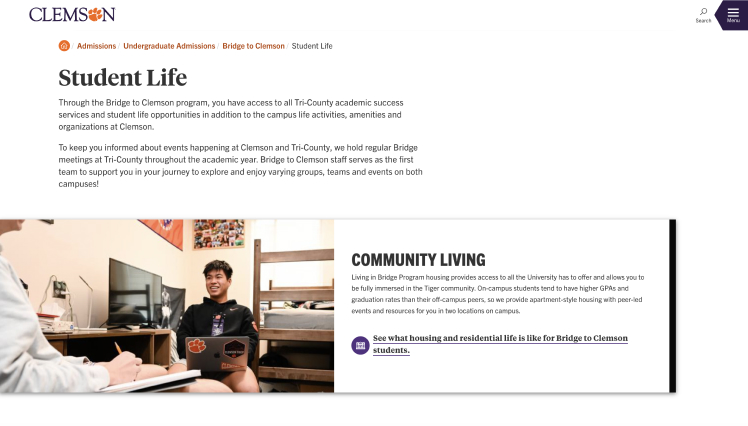
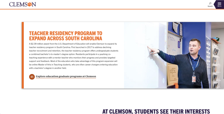
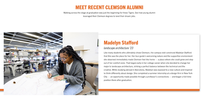
Vertical Accent - No Offset Image
This option shows the thick accent color on the left or right depending on the position of the object chosen. It will display the image in line with the module's background color.
Spotlight Modules
Bottom Accent With Offset Image
This option shows the thick accent color on the bottom and displays the image slightly above the top of the module's background color. It gives a parallax scroll effect, which is a visual effect that mimics depth by making the foreground and background elements on a webpage scroll at different speeds.
Two-Column Call to Action
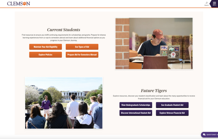
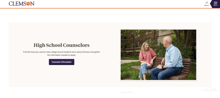
The two-column call-to-action widget is used when information needs to be highlighted that goes with a specific call to action or a specific set of CTAs. It is just another way to organize the content so that the CTAs stand out on the page. You can have up to two rows within this module, and/or you can opt to have the image on the left with content on the right, which is opposite of the image shared below.
With this module, there are no enforced character limits, but the general rule of thumb is to keep it short and simple so that the content doesn't expand past the height of the image.
Dynamic Feeds
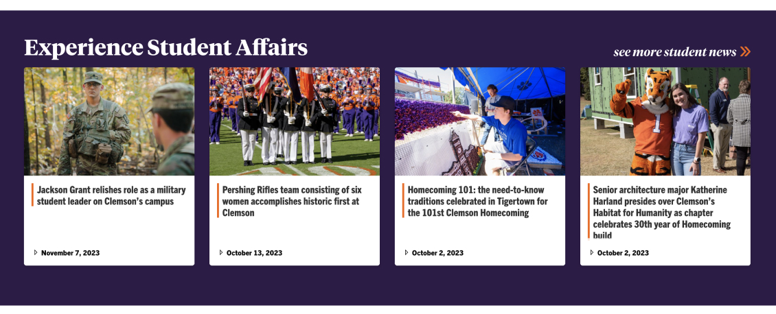
News
This module will automatically load Clemson News stories in a styled format based on categories or tags. To generate the appropriate code, please access the Clemson News Builder Tool.
Tiger Rankings and Brags
This will add three rankings/brags in a styled format on to the page. The rankings/brags database uses college/division and categories to display different rankings. Use the Rankings and Brags Generator tool to retrieve the appropriate param string. If more than three rankings match the tags used in the param string, the rankings and brags will change on refresh of the page.

Events
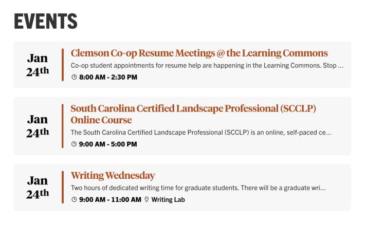
This will add three or four events into the section in a styled format. The events calendar uses audience types and departments to allow specific types of events to be displayed in the events feed. To retrieve the appropriate code for building your events feed, use the Events Builder Tool then paste the code into the events module in the template.
Blogs
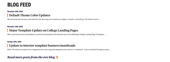
This will add a given number of blog posts in a styled format into the page. The blog feed uses the name of the blog to pull in the data. The name is the exact name/parameter in the URL, e.g., "ows" in https://blogs.clemson.edu/ows/.
The feed accepts the following parameters: number of posts, categories, tags. There is also an option to display images or not.
Custom PHP
This is available for very specific purposes. It is not an open invitation to bypass the template structure.
To include PHP files, the structure of the include path will depend on the publishing location of your website. You will need to include everything after "clemson.edu", including the first slash. As an example, if my PHP include file named "file.php" resides under the Business website in a folder named "include", making the URL to my include file "https://www.clemson.edu/business/include/file.php", then my include path would need to be set as follows: /business/include/file.php
Widgets
Column Content Widgets
Column widgets can be selected on the page within the columns module. The columns module must be set to a column width of six or more for the widgets to be available.
Accordions
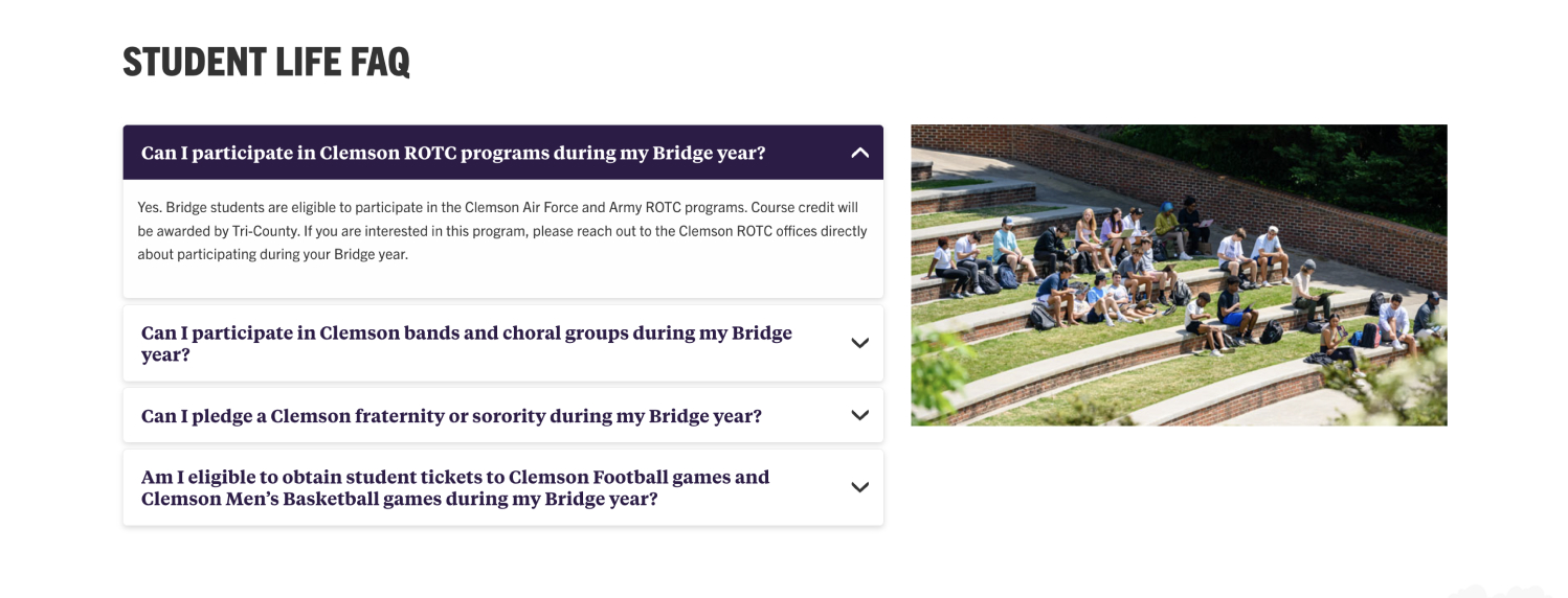
An accordion is used to show (and hide) HTML content and is very useful when you want to toggle between hiding and showing large amounts of content. Multiple accordions are generally grouped together at a time.
Featured Quote
The quote feature offers a stylized way to display an image of the person who gave the quote along with the specific quote. This widget can only be chosen within the columns module in which the width of the columns must be six cells larger.
For the quote text, do not add quotation marks. Quotation marks are dynamically added in. The image size should be 300x300px, and the image will be auto cropped into a circle. This is intended to be an image of the person who said the quote.
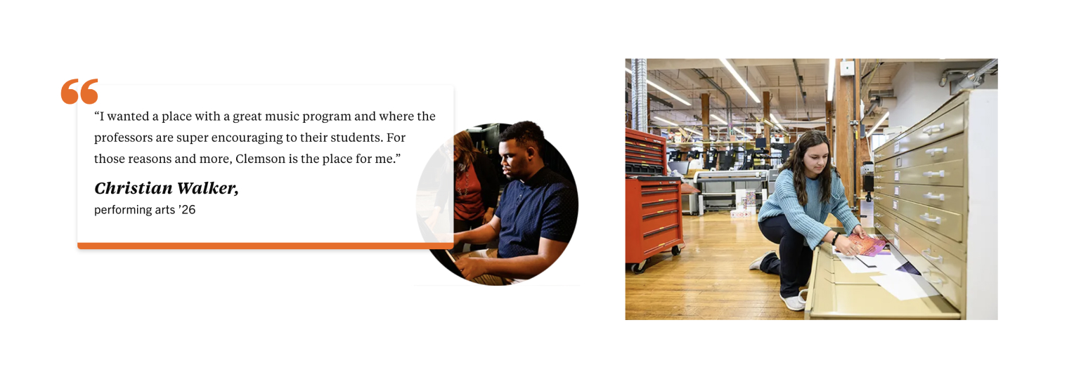
Image Buttons and Icon Cards
Both image buttons and icon cards can be used as widgets inside of your column layouts. The number of cards and buttons will be limited based on the set column width.
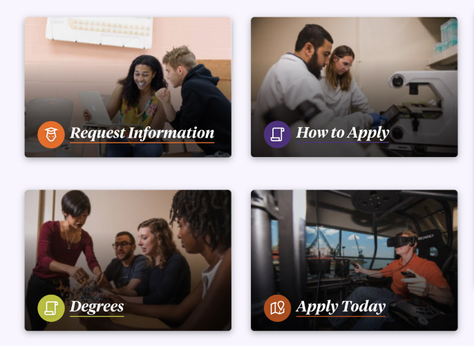
Image Buttons as widgets in a column module
Icon Cards as widgets in a column module
News, Events and Blog Feeds
These feeds behave the same as their module counterparts, but the items displayed are limited based on the number of columns selected.
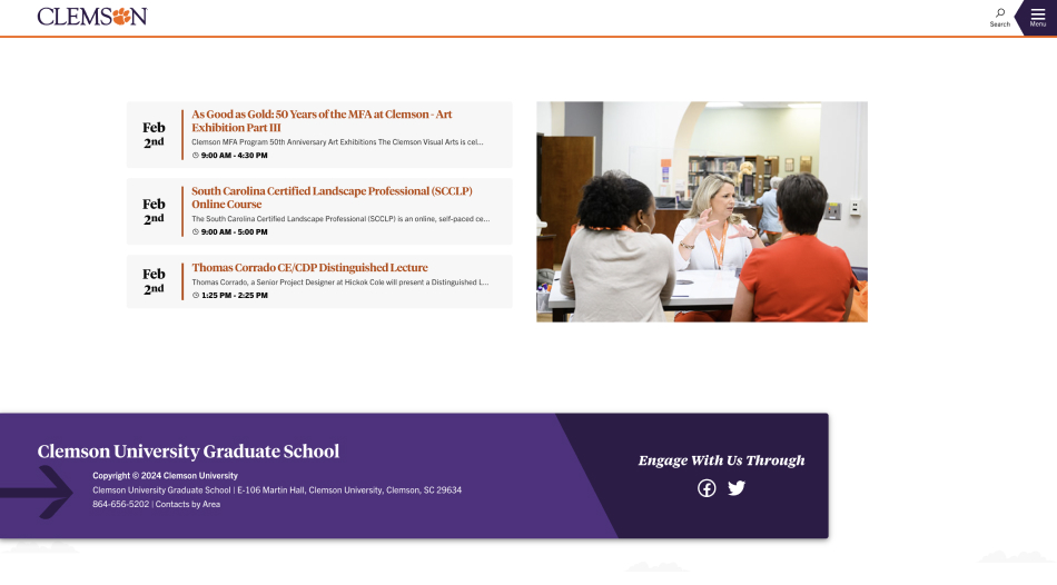
An events feed implemented on the page as a widget rather than module
Independent Widgets
These widgets are built separately from the page by going to the 'Add content' tab in Cascade. These are independent so users can create a single widget that can be used/shared across multiple pages, and when they need to be updated, only the widget has to be published as opposed to publishing all pages that utilize the widget.
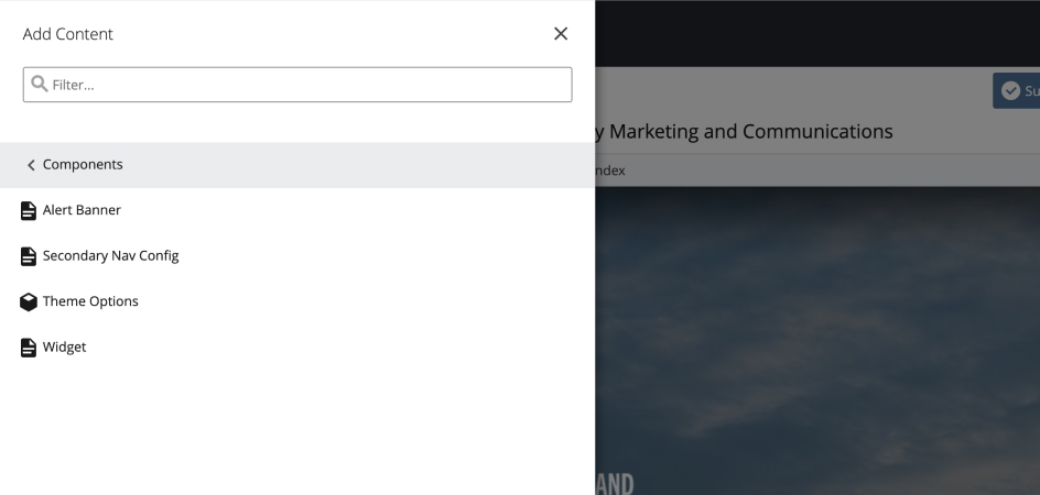
Widget option in the "Add Content" menu
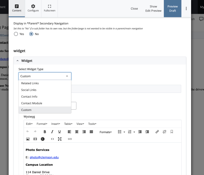
Edit widget panel showing the dropdown for selecting widget type.
Left-Column Widgets
These widgets can only be added to the left column pages. Up to two independent widgets can be added, and the order will depend on your selections.
- Related Links - Add related links below the logo in the left column.
- Social Links - Add social links below the logo in the left column.
- Contact Info - Add contact info below the logo in the left column.
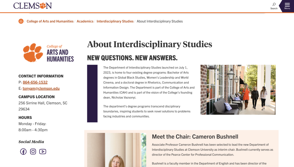
The Contact Info Widget will be styled to match the theme selected for the website.

The Related Links widget is shown in the lefthand column on the Bridge to Clemson site
Contact Ribbons
The contact ribbons will go at the bottom of the page(s) where it is included. It can be customized to include what social platforms and contact information your organization wants to promote.

The Contact Ribbon will be styled to match the theme selected for the website.
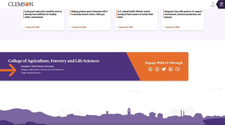
Contatct Ribbon widgets will be placed at the bottom of the page just above the footer.
Custom
If you would like to include a custom designed portion of content that will be repeated in the lefthand column or bottom of multiple pages, this widget allows you create your own design in HTML and CSS.
