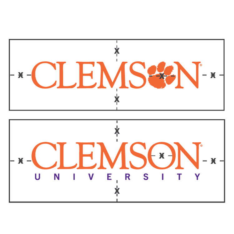
- The Clemson logo must be protected and elevated, always having a clear space around it where no other elements appear (such as typography, other logos, graphics or photos that intrude upon the logo).
- Be mindful of maintaining this clear space, and do not place the logo too close to the paper’s edge, any folded edge, any cuts or embossing.
- The clear space of the Clemson wordmark is “X,” as defined by the width of the counter (the inner space) of the “O” or the Paw in Clemson.
Logo
Logo Usage
Clemson University logos are subject to trademark and licensing approvals. A five-level system clarifies their graphic identities and marketing use.

Clemson Logos and the Brand
Logo and Wordmark Guidelines and Standards


A Clemson University logo or wordmark is a standardized graphic representation associated with this institution. Because of the value to Clemson University, any logo or wordmark that is intended to represent the University is the property of the University and must fit all University guidelines. Logos and/or wordmarks may not be used for commercial purposes without prior approval of the University’s Trademarks and Licensing Office.
To provide brand recognition and connect University units with the Clemson University brand, print and digital communications for all Clemson University units should reflect consistent graphic identity standards.
To maintain brand consistency, a five-level system clarifies current logos and helps bring consistency to any future logos or wordmarks. Any logo variations must be approved in advance by the Division of Marketing and Communications.
General Limitations and Restrictions
These elements may not be used to designate a business, social, political, religious or any other organization, or to imply or otherwise suggest the University’s endorsement, support, favor or association with any organization, product or service without permission of the University and the University’s Trademarks and Licensing Office.
Any acronym must have the descriptive name designed as a lockup of the acronym in the logo design. In the case of T-shirt design use, a separation of the lockup of the acronym and the descriptive text would be allowed, but both should appear on the shirt.
As Clemson is an academic institution, beer, wine, alcohol, tobacco, firearms, religious, call to action, gambling or political advertisements will require rigorous review, and all advertising and/or use of federally protected Clemson marks (athletic or campuswide) will require the prior written consent of Clemson University Director of Licensing after receiving ELT-level approval.
All imprinted products containing University wordmarks must be produced by a Collegiate Licensing Company (CLC), Clemson-licensed vendor (T-shirts, giveaways, etc.). For more information on licensing and a list of Clemson CLC-licensed vendors, visit the Licensed Vendors page.
Logo Clear Space


- The clear space of the academic and nonacademic marks is 1/2 “X,” as defined by the width of the Paw in the mark.
Unacceptable Logo Applications
Do not add any effects such as bevels, drop shadows or outlines or change or manipulate original colors. Do not use the Paw to mask images.


Improper Use Example - Color and Effects
Do not stretch, bend or alter any proportions.


Improper Use Example - Proportion Alterations
Do not use the logo over a tint unless it provides excellent contrast and legibility.
Do not partially reverse a logo out of a tint or screen, and do not use any tints other than those in the palette. If in doubt, check with executive creative director Jesse Godfrey at jesseg@clemson.edu.


Improper Use Example - Logos on Screen Tints


Proper use Example - Logos on Screen Tints
A partially reversed logo over a photo can work, but do not use a busy photo or a photo that is too light to provide sufficient contrast.
Insufficient Contrast

Appropriate Contrast

